Understanding the factors that play a major role in human health is extremely beneficial for both identification and preventative measures for diseases. One such disease, diabetes, impacts many people around the US and world. Typically associated with insulin resistance, diabetes can have major implications on health; in some cases even resulting in amputation of limbs or death. Diabetes is classified as 2 main forms, Type I and Type II diabetes. Type I diabetes is often genetic and arises earlier in life. Type II diabetes is majorly influenced by lifestyle choices such as poor diet, increased weight, or low exercise. If models could be built to predict those at risk for Type II diabetes this could have serious implications for preventative measures. This requires both an understanding of what are the best predictors for diabetes? This then also begs the question what techniques best model the relationship between various predictors and diabetes outcome? I have constructed a shiny app that allows users to explore the impact of different predictors and models for diabetes. In this app there is one data exploration tab and 5 modeling techniques.I will highlight some of the features in this blog post!
The data for this exploration was found on kaggle. The data consists of 768 cases with 8 parameters and if they developed diseases. Data columns can be seen below.
Pregnancies: To express the Number of pregnancies
Glucose: Blood glucose level
BloodPressure: Blood pressure measurement
SkinThickness: Thickness of skin
Insulin: Insulin level in blood
BMI: Body mass index measurment
DiabetesPedigreeFunction: Diabetes percentage using genetic factors
Age: Age in years
Outcome: Diabetes outcome - 1 is Yes and 0 is No
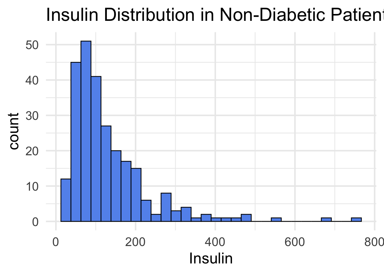
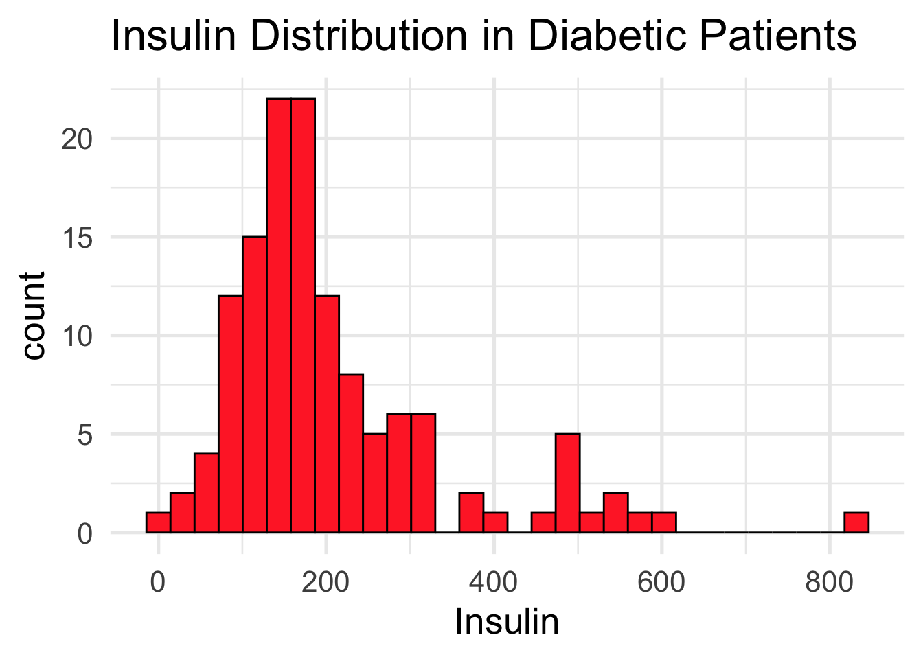
The first tab in the shiny app allows the user to select a predictor and compare the distribution of diabetic and non-diabetic groups. Differences in the two distributions could indicate a strong predictor to be implemented in the other tabs. An example output of Insulin levels between the two groups is displayed below. Notice the higher insulin levels in the diabetic group (red).
The Parttree tab in the shiny app lets the user look at how a decision tree classifies two predictors. This plot overlays the true data points with the visual to highlight how the data influences the model’s area distribution. In the other shiny app tabs there is a logistic model, QDA, LDA and Naive Bayes model. Many of these modeling techniques do not have effective ways to visualize them which makes them much harder to understand and share. Below is a static output using BMI and Age as predictors. Areas and points in blue represent diabetic outcome while red is non-diabetic outcomes.
data$Outcome = as.factor(data$Outcome)

## Build our tree using parsnip (but with rpart as the model engine)
tree =
  decision_tree() |>
  set_engine("rpart") |>
  set_mode("classification") |>
  fit(Outcome ~ BMI + Age, data = data)


## Plot the data and model partitions
data |>
  ggplot(aes(x = BMI, y = Age)) +
  geom_jitter(aes(colour = Outcome), alpha = 0.7) +
  geom_parttree(data = tree, aes(fill = Outcome), alpha = 0.1) +
  labs(x = "BMI",
       y = "Age",
       title = "Classification Areas of Diabetes") +
  theme_classic(base_size = 24)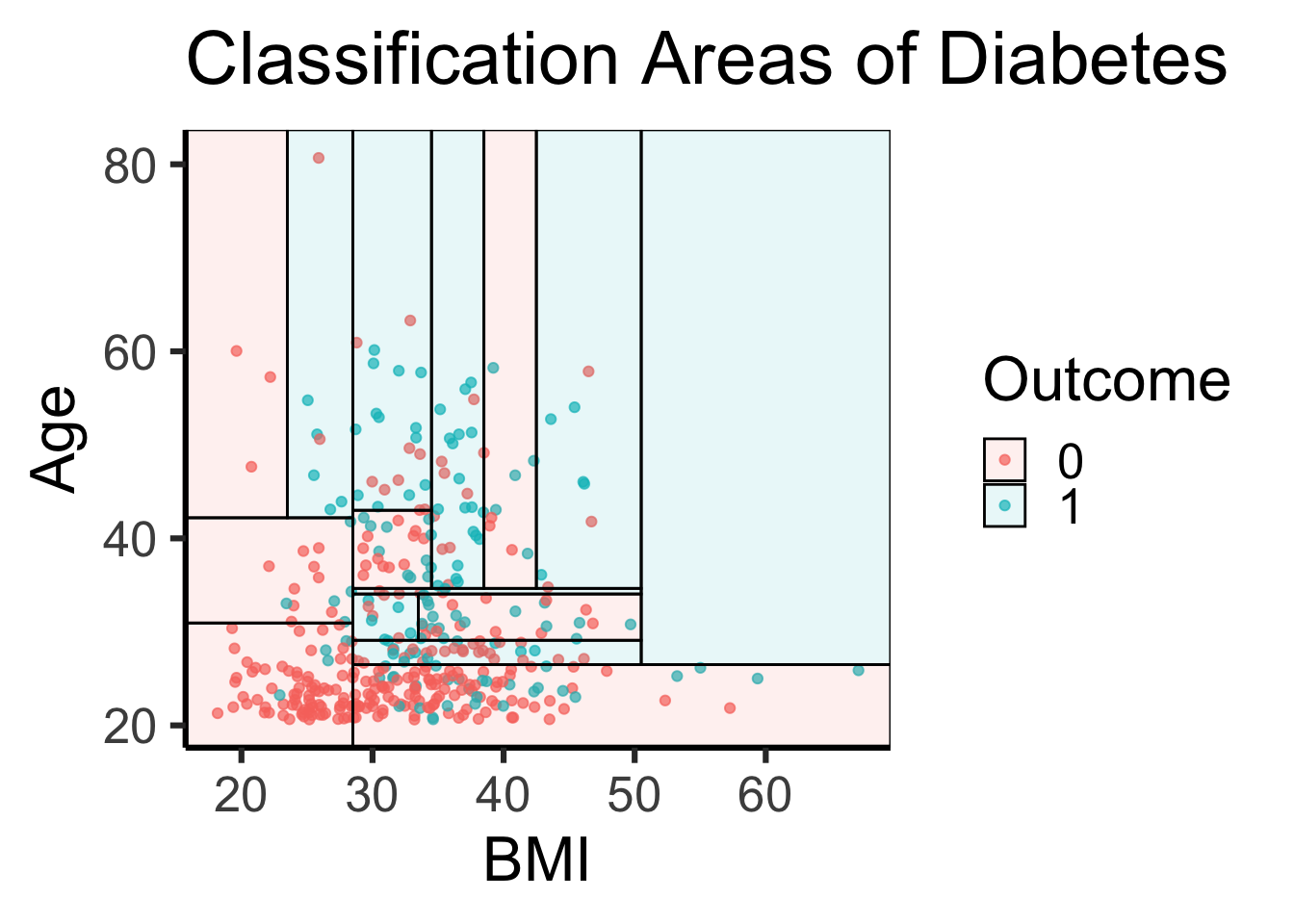
The shiny app has 5 modeling methods and allows the user to play around with the relationship between various predictors and diabetic outcome. I used the app to identify combinations of predictors and applied them across the tabs to find the optimal model for predicting diabetic outcome. I did not use the Parttree model in this as it is an effective visual I did not calculate a test error for this model. Between the other 4 models all had very similar baselines around 22% test error with the logistic model having the lowest (21.438%) and QDA the highest (23.248%). I then changed the models to have the lowest test training error I could find. Not all models had the same predictor to minimize the error. The best model configuration are listed below with their test error rate.
Glucose and age are used in all optimal model configurations as predictors. On top of this the top 3 models also all share the diabetes pedigree function. This indicates that age, blood glucose levels and genetic factors are three big predictors in diabetes outcome (of the predictors in our data set). Furthermore we can see that the logistic model has the lowest error rate. With that in mind, all 4 models are extremely close and test error can fluctuate due to the random sampling of test vs train data. With this in mind there is some indication that the logistic model is the strongest but cannot be said definitively that it is better then the others.
I hope that this shiny app is used to identify people at risk for diabetes. I think this modeling approach could be applied to many areas of medicine for preventative care. Furthermore, once these models are constructed I think that a Shiny app interface that allows user to input their measurements and then indicates disease they are at risk for would be extremely beneficial and could change many lives.