Using Points and Texture to predict Malignant Tumors
Cancer
Public Health
Author
Jax Lubkowitz
Published
March 8, 2024
Cancer impacts the lives of millions of people around the world. Effective identification of cancerous malignant tumors is critical for quick treatment response to improve outcomes. Non-cancerous benign tumors do not pose the same threats that malignant tumors do. With this in mind we will look at how points (a tumor scoring system) and tumor texture can be used to identify tumor types. Taking this one step further we are going to investigate how a model could classify different points and visualize this in a clear and concise way.
This data set comes from Lisa Torrey’s Machine Learning Class.
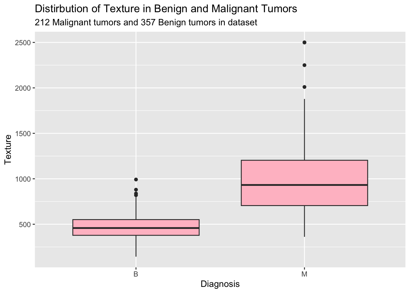
library(tidyverse)data <-read.csv("https://myslu.stlawu.edu/~ltorrey/ml/Cancer.csv")ggplot(data = data, aes(x = diagnosis, y = texture)) +geom_boxplot(fill ="pink") +labs(title ="Distirbution of Texture in Benign and Malignant Tumors",subtitle ="212 Malignant tumors and 357 Benign tumors in dataset",x ="Diagnosis",y ="Texture")
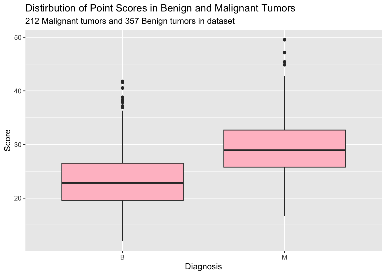
ggplot(data = data, aes(x = diagnosis, y = points)) +geom_boxplot(fill ="pink") +labs(title ="Distirbution of Point Scores in Benign and Malignant Tumors",subtitle ="212 Malignant tumors and 357 Benign tumors in dataset",x ="Diagnosis",y ="Score")
As we can see through these visuals it appears that malignant tumors have increased texture and higher point scores then benign tumors. This indicates that these could be good instances to use in tumor prediction. For example a tumor with a higher score and increased texture has attributes similar to malignant tumors then one that has minimal texture and a score below 10 and thus we might be able to use this to classify future tumors. Now when building a model such as this it is much easier to see how models predict as opposed to ranges of numbers. To do this we will use a parttree showing areas where tumors are likely to be malignant vs benign.
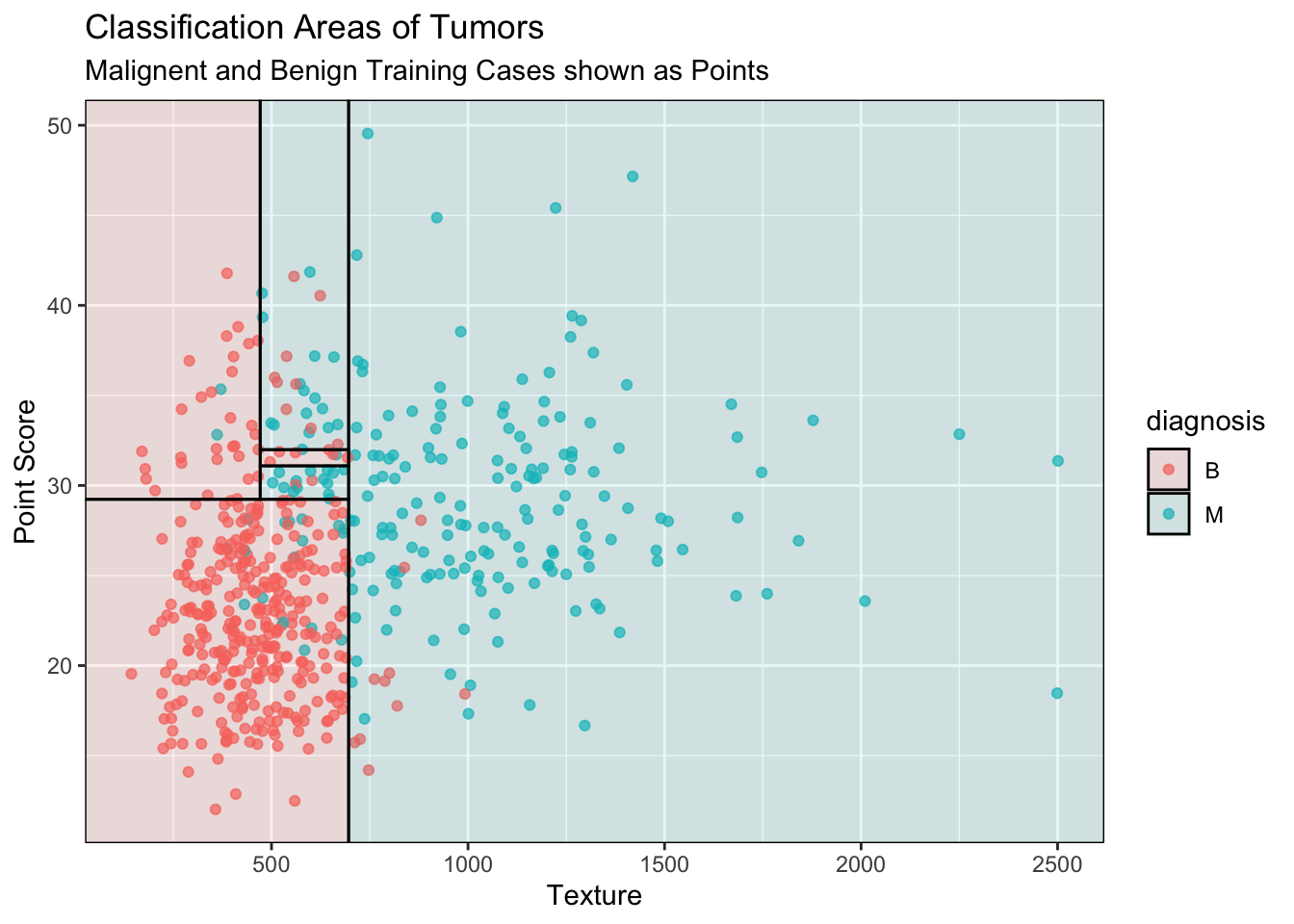
library(tidymodels)remotes::install_github("grantmcdermott/parttree")library(parttree)set.seed(123) ## For consistent jitterdata$diagnosis =as.factor(data$diagnosis)## Build our tree using parsnip (but with rpart as the model engine)tree =decision_tree() |>set_engine("rpart") |>set_mode("classification") |>fit(diagnosis ~ texture + points, data = data)## Plot the data and model partitionsdata |>ggplot(aes(x = texture, y = points)) +geom_jitter(aes(colour = diagnosis), alpha =0.7) +geom_parttree(data = tree, aes(fill = diagnosis), alpha =0.1) +labs(x ="Texture",y ="Point Score",title ="Classification Areas of Tumors",subtitle ="Malignent and Benign Training Cases shown as Points")
From this visual we can see that using point score and texture classifies malignant tumors at higher ranges for both predictors. In addition we can see that there is a small range around a point score of 30 and texture of 500-600 that is often cancerous. This might be due to our training data set but could be investigated more with a larger data set. This visual allows us to see the boundaries of where this model would predict malignant or benign. Furthermore we can see how the model generalizes trends in the training data to a larger area for future points. Many other variables could be used in a classifying model but expanding beyond 2 predictors makes visualization much more difficult. I would like to see if there are more unexpected or stronger 2-predictor pairs for tumor identification within this dataset.
While using a model such as this is not a fail-proof method for identifying cancerous tumors, it does pose a way to flag tumors that have increased chance of being cancerous in a cheaper and faster way to identify tumors that need immediate attention. While medical work often requires expensive procedures using a model that can rely on scan data such as texture and score can help mitigate the cost and increase treatment response time. The preliminary data could identify cancerous tumors before biopsy, histological or genetic analysis can be done. Furthermore this model represents a less invasive alternative (though should not replace further tests) to classify tumor types. Ideally this model would be used to speed up treatment and further medical procedures on malignant-predicted tumors and should never be used as the only identification for benign tumors as a false-positive has much fewer implications on human lives then false-negatives.
Connection to Class
My first two visuals are basic box plots. I chose box plots because while they do not allow the viewer to see how many data points are present I added this manually. In doing so the user can see counts, distributions, spread, out liars and average within each class. In my next visual I used one of the exercises we have in our notes but did not review in class. Using this visual is a much simpler and effective way to convey both a model and distribution of our own data. I could have built the classifying model and print the coefficients and statistics but this is hardly interpretable. By doing a parttree we can see the decision boundaries that separate areas where a model would classify a point to benign or cancerous. This visual also helps show the relationship between our model and our training data with both the points and parttree colored in the same way further clarifying how class distribution impacted our model.