In light of the COVID pandemic, vaccinations have been in the front of peoples minds. Vaccines cover much more then COVID and have been implemented at state and federal levels across the country. Many schools require vaccines to prevent the spread of disease. A common vaccine for children is MMR - a vaccine for Mumps, Measles and Rubella. In this data set we will explore vaccination rates and trends throughout 46,412 schools in 32 states. This of course begs the question where are students most vaccinated and where are students least vaccinated? To look into this we will look at geographic location and type of school.
Data: Tidy Tuesday
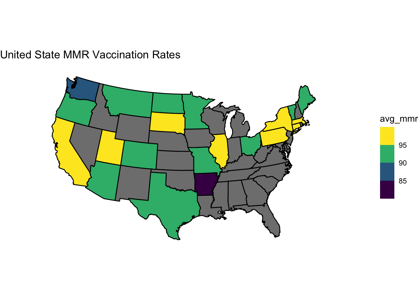
In this visual we can see states with MMR vaccine rates over 95% in yellow and 90-95% in green. Washington (blue) and Arkansas (purple) can be seen with even lower rates. The distribution of vaccine rates varies across the United States and does not appear to have any larger trends. This visual allows all states and there vaccination rates to be seen with ease. Within each state there are a variety of different types of schools ranging from public to private and this could also impact vaccination rates.
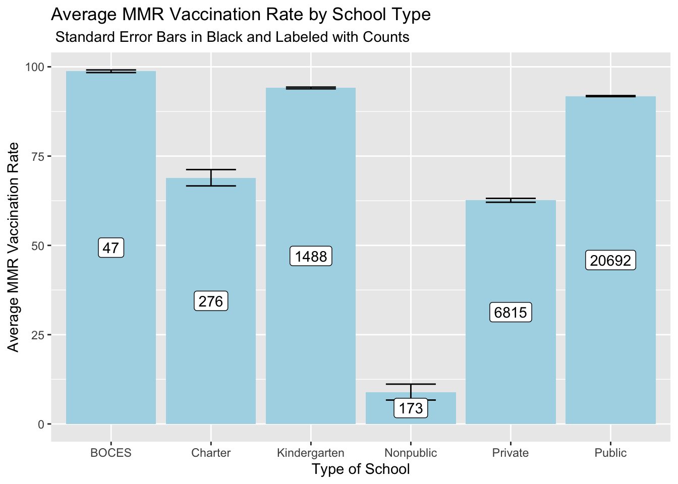
In this visual we can see how vaccination rates of MMR differ throughout school types. The standard error of the means is depicted in the black bars with no overlap between groups. The non-public schools have a remarkably low vaccination rate compared to any other group followed by private then charter schools. The number of schools in each sample group can be seen in the white box on each column. We can also see at BOCES, kindergarten and public schools almost all kids have received their MMR vaccines.
Using this data set we can see trends on how vaccination rates differ by state and school type. That being said many states are missing from this dataset and many schools have many null values. I eliminated null values for the first map in the mmr avg and in doing so inadvertently eliminated 11 states completly (of 32) that only had null data for mmr vaccines. Moving forward I would love to look at vaccination datat from the rest of the states. I would be curioes to also explore vaccination rates in the years leading up to the pandemic vs after the pandemic. Are people more likely to get vaccinated after a global pandemic?
Connections to Class
My first visuals uses concepts we learned in building maps. In addition this visual uses a unordered color scale with bins to show how states land in their vaccination rates. This map does not show sample size, distribution or actual averages. In the second graph we have normal bar chart of each schools mean but I added error bars to show variation within each class, and counts to show the total within each class. In doing so I converted a visual that does not depict much information to one that conveys a lot more. It might have been better to use a box plot to show the distributions even more (as well as outliars) but I wanted to implement error bars we used in class.